Branding
Branding with no eye on sales is just vanity
Sep 21, 2026
Read nowThe logo calls people in. The reputation invites them to stay.
Zé Paulo Gomes April 10, 2025 8 min read
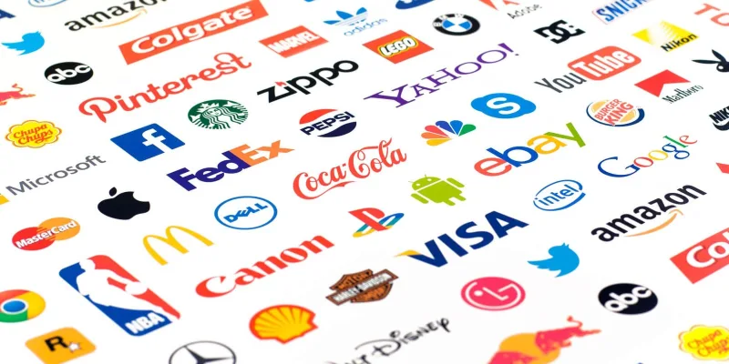
A logo is not a graphic ornament. It is the visual signature of the brand, the bridge between what it is and what it means to people. With a few strokes, a good logo creates recognition, stirs emotion and anchors meaning. To build a memorable logo you have to understand that we are dealing with a symbolic form of communication. The logo does not need to tell the whole story of the brand, it needs to carry enough for that story to start in the head of whoever sees it.
A logo is a visual sign that represents the identity of a brand in a single glance. Its job is to trigger instant recognition, condense values and carry the essence in a way words alone cannot. So when we design a logo we are creating much more than a pretty image. We are designing how the brand will be recognized, remembered and felt.
There are different ways to represent a brand visually, and understanding the differences is essential for making the right choices.
Wordmark: letters only. It is the brand name styled in a singular way, turning words into identity. Coca-Cola, with its flowing type, and Google, with its clean and colorful design, are classic examples. A wordmark makes the name instantly recognizable, and it depends on the strength of the word to build meaning.
Symbol: the pure mark, with no text supporting it. The Apple apple and the Nike swoosh show how an icon can become universal. Creating one takes more than good design. It takes a strong association strategy, so the symbol becomes recognizable enough to drop the name.
Combination mark: text and symbol appear together, and can also be used apart. Adidas and Lacoste are good examples. The three stripes or the crocodile work alone because the audience already associates those icons with the brands. It allows flexibility and suits brands that need visual versatility.
Emblem: text and symbol fused into one indivisible unit. Starbucks and Burger King are the obvious cases. The advantage is a cohesive visual identity, and the drawback is less flexibility across applications.
The visual style of the logo also speaks about the brand. Minimalist logos carry modernity and confidence. Organic shapes evoke creativity and nature. Geometric designs suggest reason and order. Expressive type turns writing into identity. Vintage styles bring nostalgia and credibility, while mascots and characters humanize and create identification. Every style choice communicates values and positioning, whether you notice it or not.
A few principles are essential for building a memorable logo. Gestalt teaches us how the brain completes shapes and builds meaning out of empty space. Using proportion and grids is not fussiness, it is how you guarantee visual harmony. Stress tests, such as legibility at small sizes and performance in black and white, prove the real strength of the design. A logo that only works large and in color is not finished.
When creating a logo, many professionals focus on aesthetics alone and forget something vital: whether it can be registered. The visual identity of a brand is legally protected, and a logo cannot infringe existing registrations. Creating something beautiful but legally unviable puts the whole job at risk. Before closing the visual identity you have to run a prior search and weigh the real chances of registration.
Creating a memorable logo goes far past the aesthetic stroke. It takes sensitivity, strategic thinking and active listening.
1. Empathy. Before any drawing there is listening. Empathy here is the ability to understand what moves the brand and the people it wants to reach. It means understanding the fears, the strengths and what the brand wants to change. It also means understanding the customer world: their pains, desires, behaviors and beliefs. A real logo starts by listening more than answering.
2. Definition. With the information organized, it is time to define the right problem to solve. Not every brand needs a pretty logo. It needs a logo consistent with its strategy, its market and its positioning. This stage involves personality maps, archetypes, visual territories and symbolic directions. This is where the real brief is built, the one that guides the work with clarity.
3. Ideation. Time to open the creative game. Gather references, explore visual concepts, test ideas that look unlikely. Ideation is a wide phase, with no censorship, where quantity generates quality. Names, shapes, type, colors and visual metaphors start taking form.
4. Prototyping and testing. Good ideas only prove themselves in practice. It is essential to test the logo across formats and contexts: letterhead, social media, packaging, storefronts. A strong logo survives black and white, small sizes and a cracked phone screen. It also matters what people feel when they see it. What do they understand? What do they remember?
5. Implementation. A logo is not born to sit in a folder. It has to live. That requires consistent application, a good identity manual, aligned teams and coherence across every point of contact. Implementing a logo means making sure everyone around the brand knows how to use it with meaning and respect.
Following graphic fads. What is a trend today becomes a cliché tomorrow. The wave of watercolour logos between 2015 and 2017 is a clear example. Hundreds of brands adopted the style, and a few years later it already looked dated. A good logo is timeless because it is faithful to what the brand is, not to what is in fashion.
Creating complexity that does not survive real life. It is common to see logos full of incredible detail on a computer screen that get lost on business cards, email signatures and small packaging. A good logo has to stay strong even at one square centimetre.
Ignoring cultural context. Symbols carry different meanings in different cultures. A logo that works in Brazil can be rejected in another country. Creating a logo also means understanding the culture where it will live.
Producing something beautiful and empty. Good looks alone do not hold a brand up. If the logo is aesthetics with no connection to the story and the values of the brand, it becomes an ornament. The Gap rebrand in 2010 is a real example: the new logo was technically well executed and completely disconnected from what the audience felt for the brand. The rejection was so strong that within days the company went back to the old one.
When you see the Apple apple, the Nike swoosh or the golden arches, you need no explanation. You recognize it. You trust it. A good logo makes an immediate and silent impact. If you have to explain too much about what it means, it is probably not working.
If the visual identity is the skin of the brand, brand architecture is the skeleton. It is the structure that supports, organizes and connects every expression of the brand to its purpose. In strategic branding, architecture defines how a company organizes its brands, products and services in relation to the market and the audience. Without good architecture, brands scatter or compete against each other. With a well planned one, every new move reinforces the reputation and raises the perceived value.
Parent brand, or monolithic architecture: all the strength of the reputation concentrated in a single name and identity for every product and service. The advantage is maximum concentration of brand equity. The risk is that any mistake in one extension can contaminate the perception of the whole.
Endorsed architecture: the sub brands have their own identity, and are clearly linked to the main brand, which works as a seal of trust. It combines autonomy with shared reputation, and it requires balance: the sub brand has to be independent enough to be relevant and connected enough to inherit the prestige of the parent.
Independent brands: each product runs with its own identity, with no explicit link to the parent company. It allows maximum risk isolation and adaptation to niches, and it costs more to build and maintain several brands.
Hybrid model: it combines different architecture systems. Some brands are endorsed, others are fully independent. The advantage is flexibility, and the drawback is operational complexity, which creates confusion when there is no clear organizing criterion.
Those choices hit the logo design directly. In monolithic systems the logo has to be flexible enough to take in new products without losing visual unity. In endorsed architectures it has to coexist with other brands without overshadowing the autonomy of the sub brands. In independent architectures the visual freedom is greater, and even then it is worth having every brand share invisible design principles, to preserve a cultural signature for the organization.
As I write in Marcas da Empatia, brands are reputations in motion. Architecture is what gives that motion direction, coherence and purpose. A logo has to be born already carrying the possibility of growth. The logo calls people in. The reputation invites them to stay.
Oficina DIGIT@MEI
You can have both for free: Encontre um MEIo on this site and the workshop in partnership with SEBRAE Alagoas, Sergipe, Pará and Tocantins.